Using CTAs to Boost Visitor Engagement on Your Website
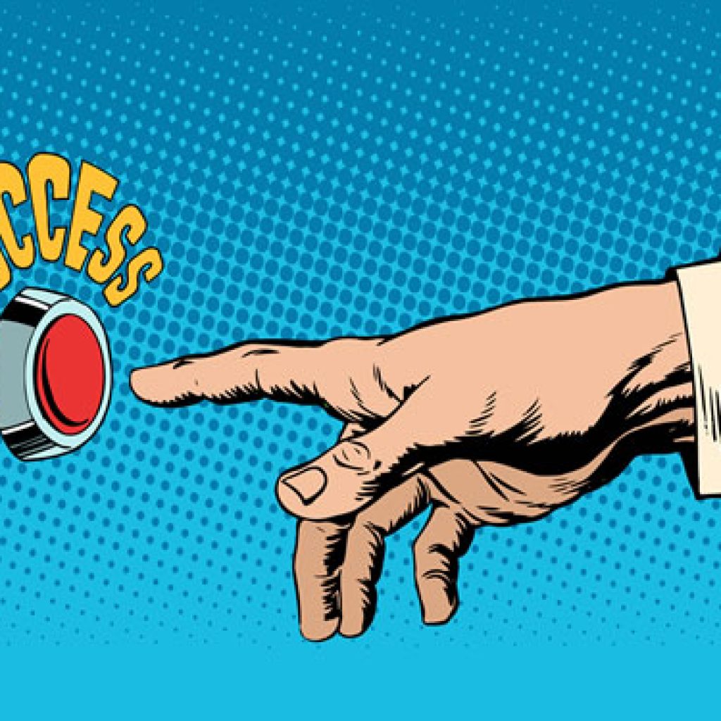
When it comes to websites, a call to action (CTA) is one of the most important elements you can include.
Whether you want visitors to sign up for your newsletter, make a purchase, or book a service, the right CTA can make all the difference. But crafting an effective CTA isn’t just about throwing a “Click Here” button on your page—it’s about guiding your audience to take that next step in a way that feels natural and compelling.
Let’s talk about what makes a CTA work and how you can improve yours.
1. Keep It Simple and Clear
First things first, people need to know exactly what you’re asking them to do. A good CTA uses clear, simple language that leaves no room for confusion. Think about the action you want your visitors to take: “Buy Now,” “Get Started,” or “Book Your Free Consultation” are all direct and to the point.
No one likes guessing games when they’re trying to navigate a website—make it easy for them!
2. Place It Where It Counts
Where you put your CTA on the page can be just as important as the CTA itself. You want it in a spot that feels natural for someone to take action. For example, if you’ve written a blog post, a CTA at the end is a perfect place to ask readers to sign up for your newsletter or explore your services. On product pages, the “Add to Cart” button should be right where people are already thinking about buying.
And don’t be afraid to repeat your CTA—especially on long pages. You don’t want someone to have to scroll all the way back up to take action.
3. Make It Stand Out
Design matters! If your CTA blends in with the rest of your page, it’s likely to get overlooked. Use contrasting colors that make your button pop, but make sure it still fits with the overall design of your site. And don’t forget about size—big enough to catch the eye, but not so big that it feels overbearing.
Even adding a little hover effect can make the button feel more interactive and fun to click.
4. Show What’s in It for Them
People are more likely to click if they know they’re getting something valuable in return. Instead of a generic “Submit” button, tell them what they’ll get. “Get Your Free Guide” or “Start Your Free Trial” lets visitors know they’re not just clicking aimlessly—they’re getting something out of it. When the value is clear, the action becomes a no-brainer.
5. Test, Tweak, and Test Again
Even the best CTAs can benefit from a little fine-tuning. Try different variations and see what works best. You can test different wording, colors, or placements, and track how visitors respond. It’s all about figuring out what resonates most with your audience, so don’t be afraid to experiment a bit!
An effective CTA is about more than just a button—it’s about guiding your website visitors to take action in a way that feels natural and beneficial. By using clear language, smart design, and thoughtful placement, you can create CTAs that are hard to resist. Keep testing and tweaking, and watch how a strong CTA can help boost engagement and grow your business!